Graphic design
Apostrophe Notebooks
D’Days
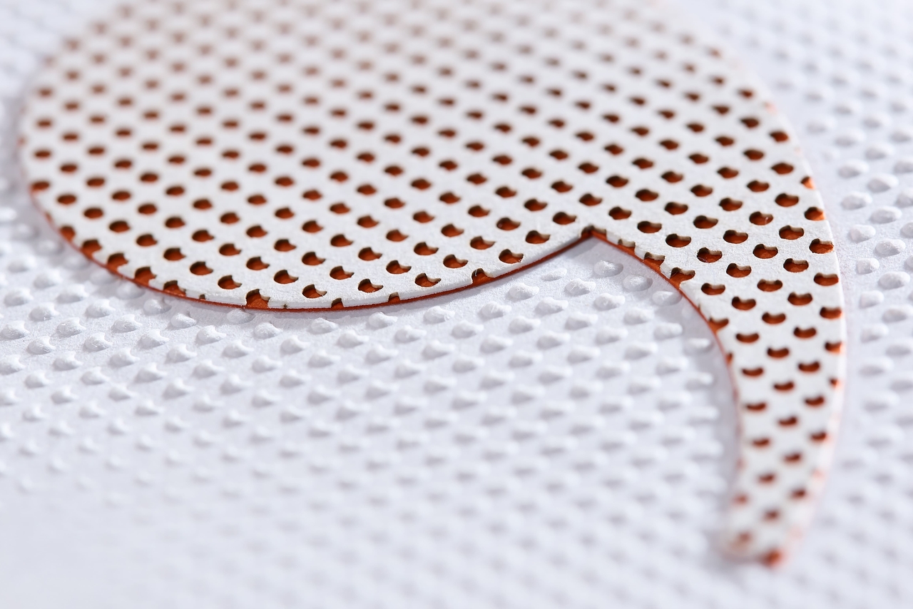
D’Days, the Paris Design Festival, presents a selection of projects each year that bear witness to the vitality and diversity of creation within the domains of industrial design, product design, interior design, and sound design.
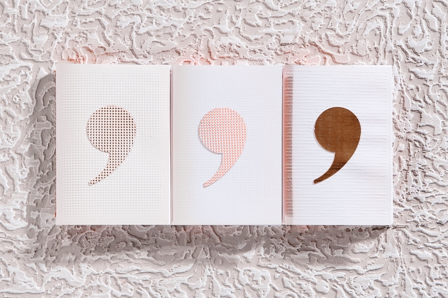
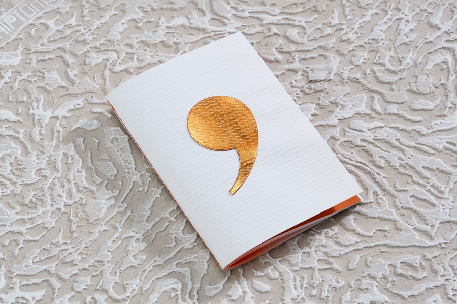
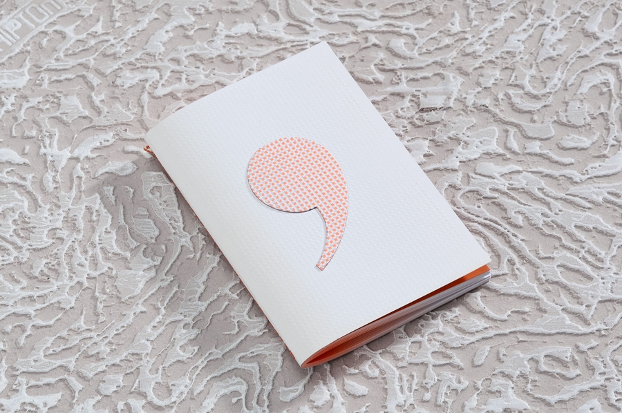
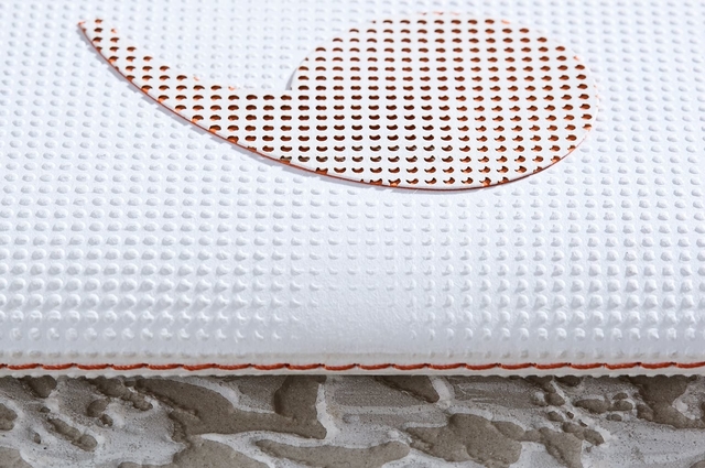
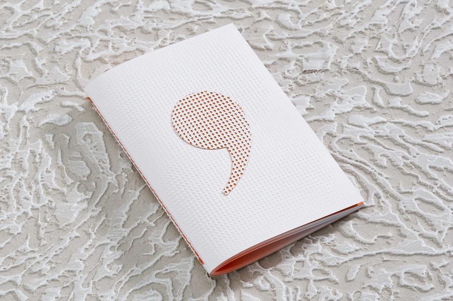
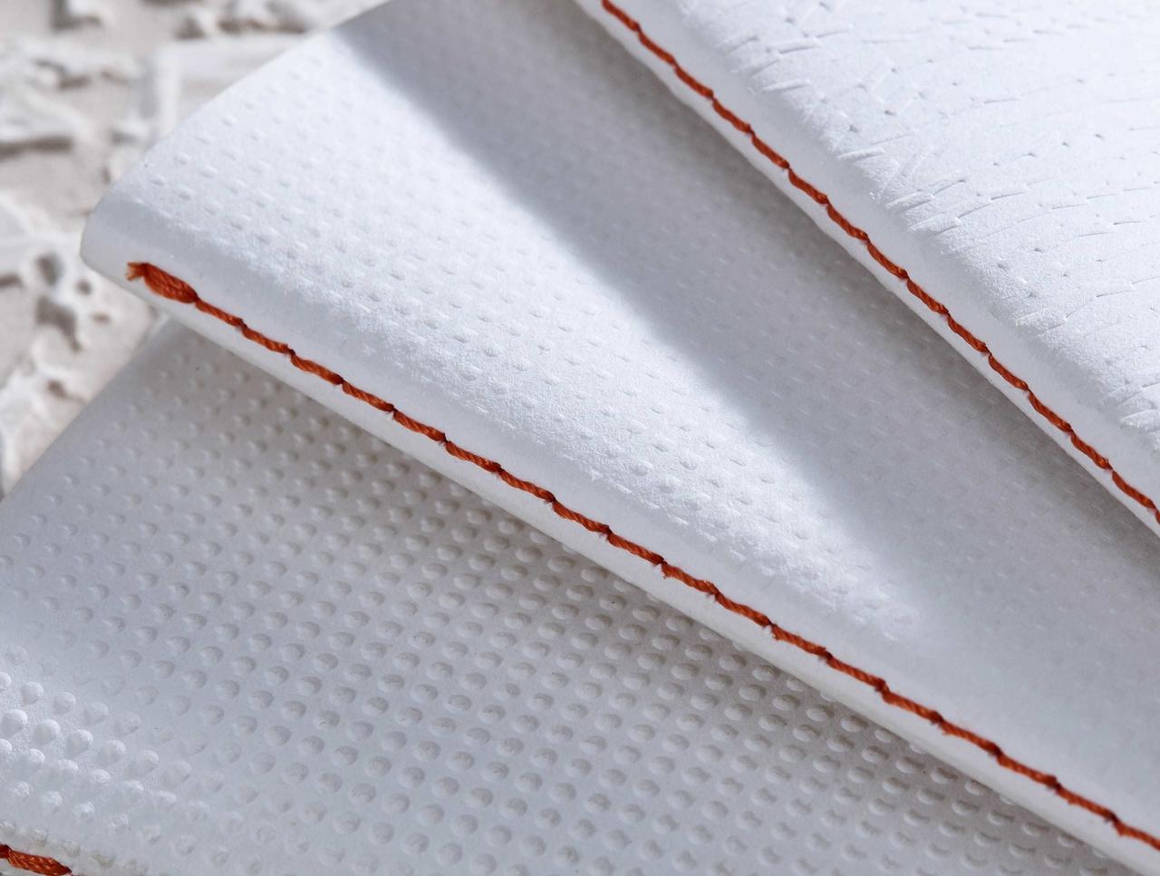
To summon the creativity of the designers and the unique expertise of the artisans for which the festival D’D is the ambassador, Undo-Redo has designed a series of promotional notebooks that highlight the printing techniques.
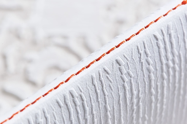
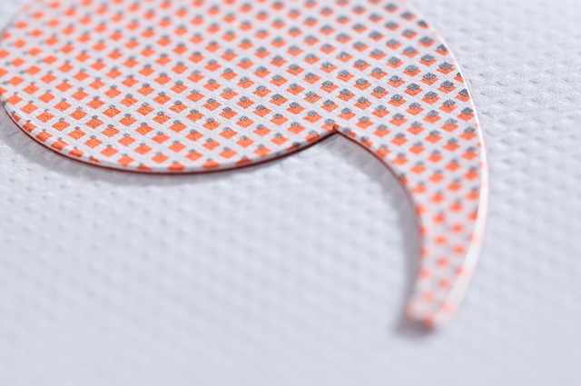
The reasons that the notebooks were designed in this way were based on the identifying symbols of the D’Days festival: the double “D” and the apostrophe in the logo as well as the neon orange color. Each design was made according to a specific manufacturing technique — blind embossing, foil blocking, silk screen printing, and letterpress — at times to create graphic shapes with subtle volumes, and at other times to underline the subtlety and finesse of the patterns.
Partenaires du projets
Fedrigoni France / papier
Grafiche dell'artiere / impression


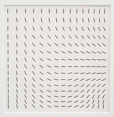
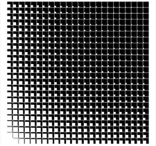
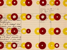
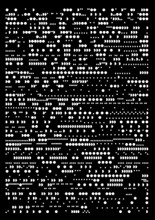
1 -
2 -
3 -
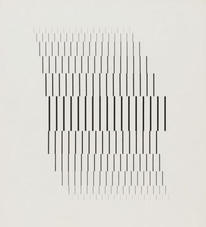
4 - Wolfgang Weingart, 1964
5 -
6 -
7 - Josef Hoffmann
8 -
9 -
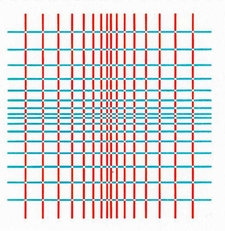
10 - Karel Martens, 1995
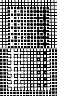
11 - Victor Vasarely, 1961
