Brand identity
Neo-rational
Christ.Christ.
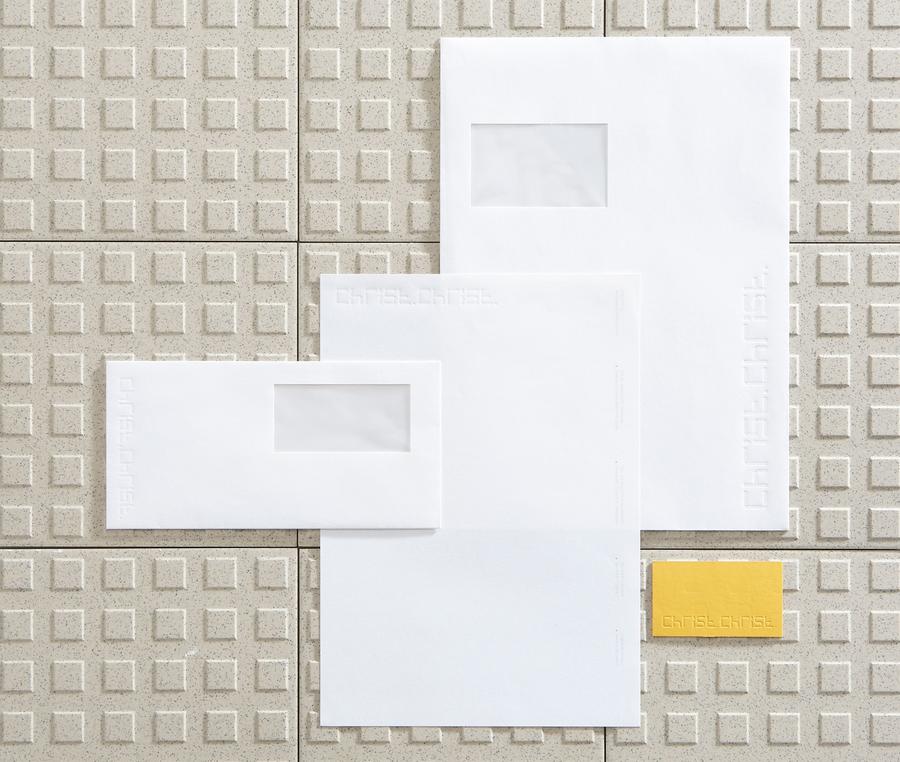
Christ.Christ. is an architecture agency based in Wiesbaden, Germany. Minimalism and a focus on detail are the key words of the project specifications to redesign the visual identity of his agency.
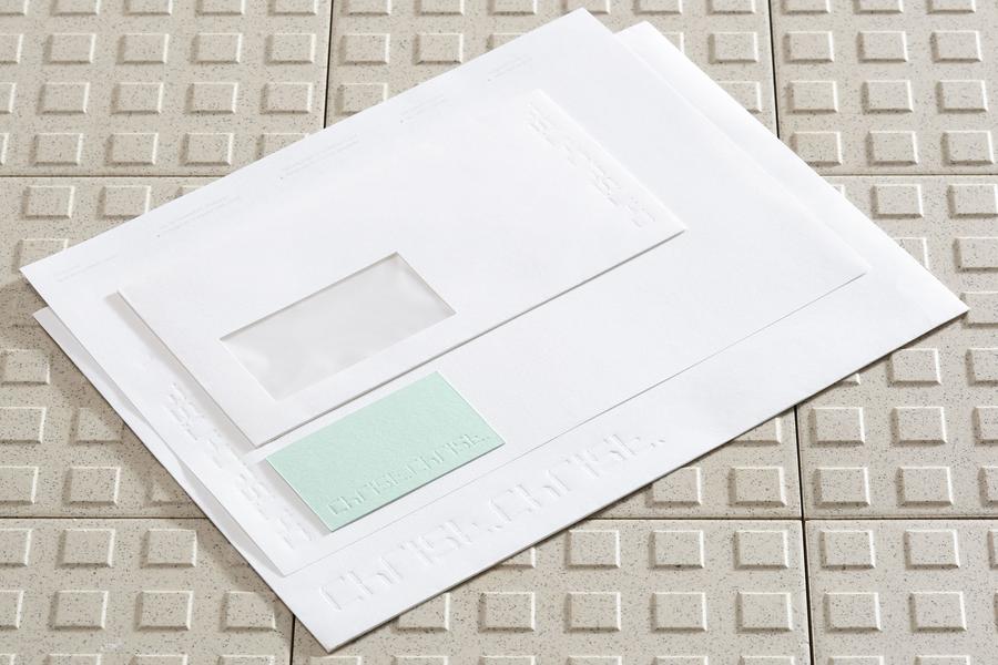
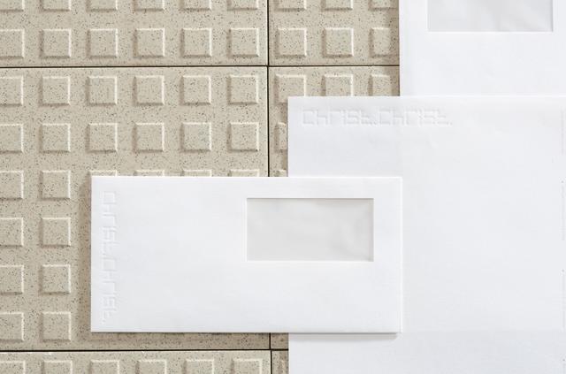
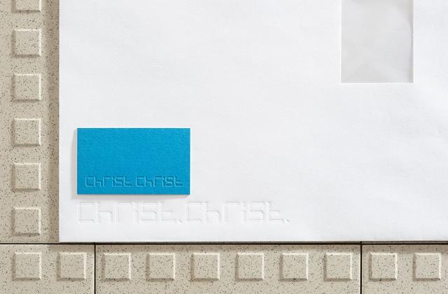
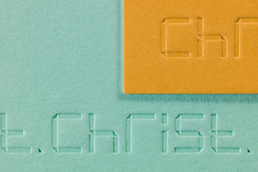
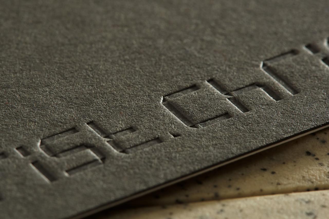
Undo-Redo creates a linear and geometric typography. The line that draws the characters is folded, like origami, and composes the drawing of each letter. These line overlays take the form of a small right triangle seen as the distinctive graphic sign of the visual identity. The element of the triangle is also used as a punctuation mark in the text and materializes, on a large scale, in the gluing tab of the custom-made envelope.
For the stationery, a clean protocol is established around the paper and its chromatic range. Two papers tinted in the mass are compressed to provide a double-sided page. One, colored, marking the identity of the agency, and the other, immaculate, and open to correspondence.
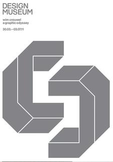
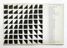
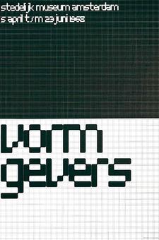
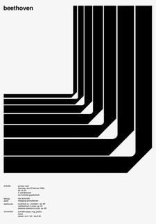
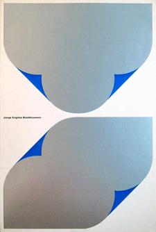
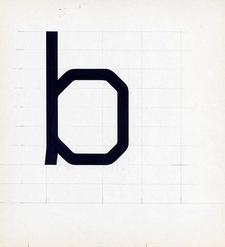
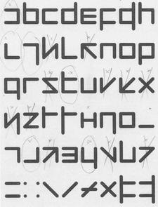
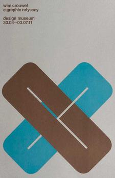
1 - SPIN, 2010
2 - Wim Crouwel, 1966
3 - Wim Crouwel, 1968
4 - Josef Müller-Brockmann, 1951
5 - Wim Crouwel, 1967
6 - Wim-Crouwel, 1967
7 - Wim-Crouwel, 1968
8 - SPIN, 2010

